New lead details for mobile - help us organize your contact data

Hello all,

We’re making some extremely good progress on the new lead details pages (replacing the deprecated apps pages) and we’re at a point now where we feel really good about mobile, but for desktop we’re still finalizing how to organize the data.

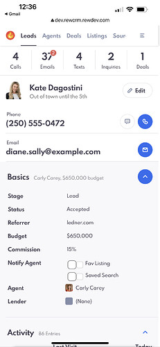
Here’s are some quick screenshots of the new mobile view btw - so shmexy!

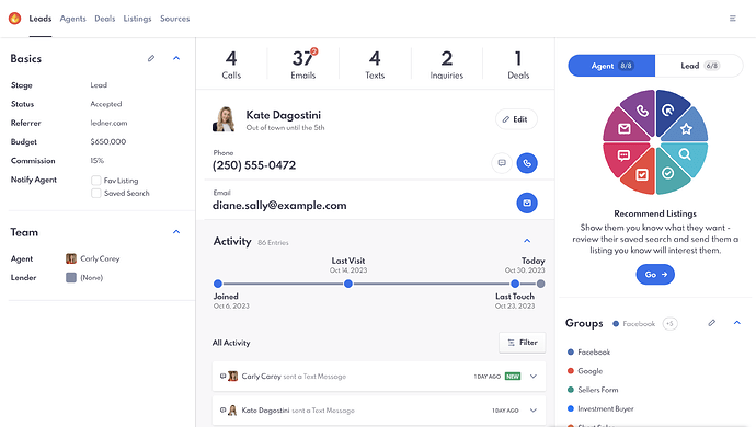
Now for Desktop (my preference for power use when in the office)

You’ll find the familiar 3 column layout. (But redesigned in a cleaner more intuitive layout)

This is where we need your feedback:

Here’s how the base is organized (our logic)

There are 3 columns: Left, middle and right).

On the left is all the information “about” a person or lead (name, address, emails, phones, budget) all that good stuff.

On the right is all the things you can do with / for / to a lead: "Assign them to a group, an action plan, tag them, etc)

And then in the middle is the activities section (what they’ve done lately, what properties,where they are in the action plan all that stuff)

So my question is: does this organizational logic make sense to you? What do you think of the layout?

Next - what would you like to see in each section? (How would you like it grouped?)

Each section is expandable/collapsible so you might have

Basic info

  • Name
  • Email
  • Phone

Financial

  • Budget
  • Prequalified y/n

Custom fields

  • Spouse
  • Dogs name
  • Favorite Sports team

See what I’m getting at here? Would love your feedback on how you would like to see your content organized.

Let us know in the comments below!
Nice, it looks great! Might be good to have the columns expandable/ collapsable as well. Depending on the size of screen someone is working off this could be beneficial. Or just make the right side collapsable.

1 Like

They have breakpoints (detecting screen sizes) so the layout is different on a small iPad (stacked) vs a larger screen/computer).

Picking up what you’re putting down though (kind of like how Smart Lists can be hidden away < left side) even now on the main lead screen.

Good suggestion.

Any thoughts on data organization? Categories and what goes in them?

This looks like a winner, mostly a visual upgrade which will mainly reflect the mobile site, since current version looks clunky. I’m more concerned with when the new mobile version will launch and if it will be ready in time before the REW app officially stops synchronizing data, leaving us in a bind.

Got it. I think having what their saved search is and/ or favourited properties would be great so we can see what they’re interested in at a quick glance. That’s usually one of the first things I look at before reaching out.

1 Like

Great look for phones. It would be nice to have the opt-in/out status in the collapsible basic section.

And an indicator if the lead is bouncing too! Currently to find out if a lead that is bouncing, we have to run a separate filter with bounced=true. Seeing a bounce indicator inside the lead makes it pretty easy to tell why a lead wasn’t getting emails, troubleshooting communications, etc.

1 Like