 Google told the world that it was going to transition to a mobile-first index in the coming quarters, and it looks like that time has come. Last week, Google announced that they have started to transition websites onto the new mobile-first index. Let's talk about what that means for you.
What is the mobile-first index?
Google has only ever had one version of its index, which is the database you're browsing every time you do a search on Google.com. This index is a super-directory of every website out there and Google maintains it using bots that crawl all the sites on a fairly regular basis.
Historically, Google has crawled and indexed websites based on the desktop version of a site, browsing websites as if they were a person sitting on their computer. However, moving forward, Google will begin evaluating sites based on the mobile version. The bots are going to look at the site from the perspective of a mobile user, which is someone on a smartphone or tablet, and judge sites based on what their experience would be.
There's still only one index, and it's the same index that it's always been, but Google has switched its approach—swapping its desktop perspective for a mobile one.
What does a mobile-first index mean for REW clients?
Here's the great news: if you're on a modern, responsive website by REW, you don't have anything to worry about. By their very design, responsive sites are mobile friendly and share all the same content on any device, which means Google will index your site and the impacts of this update should be fairly minimal.
“If you have a responsive site, you don't have to think about this.” -Gary Illyes, Google
We started phasing in responsive designs in 2013 and have exclusively built responsively since 2014, which means the vast majority of REW clients have been using this technology for several years. That said, there is a very small cohort of clients who purchased their site before or during our transition to fully responsive designs and are now due for an upgrade.
If you're unsure whether your site is responsive, head on over to this free responsive design checker and input your URL. Then, use the devices on the left to see how your site looks on various devices. If everything looks pretty good—including easily readable text, images that display well, and buttons big enough to click—your site is probably responsive.
Need to upgrade your website? Contact our product consultancy team at customers@realestatewebmasters.com to find out what your options are for a fresh, fully responsive look.
How will I know if I'm on the mobile-first index?
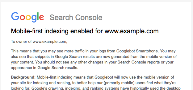
Google is using the Search Console (formerly Webmasters Tools) to notify website owners when their site has been included in the mobile-first index. Once your site is in the new index, you'll receive a notification similar to this one:

If you aren't already using Google Search Console, now is definitely the time to sign up for this free tool. In addition to knowing when you're added to the mobile-first index, you'll receive priceless insight into the indexing health and status of your site.
You can sign up for Search Console here and will need to follow some simple validation steps. Use the Analytics verification method if you already have a Google Analytics account set up, as it will require no additional steps on your behalf.
The bigger picture for the mobile-first index
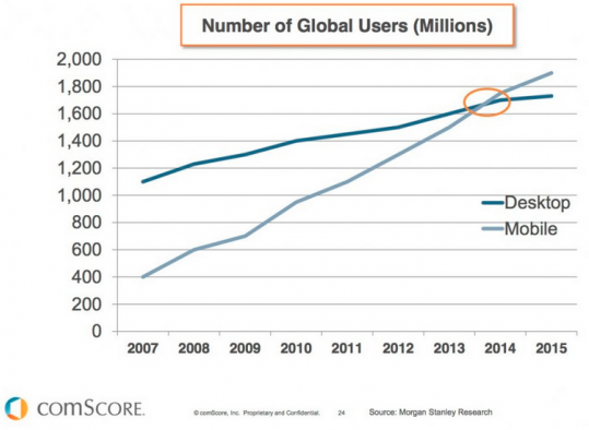
Google is switching to a mobile-first index because users have switched to mobile first. In fact, we've long been in the era where the volume of mobile users has surpassed desktop, and it's a bit surprising that it's taken Google this long to make this move.
The reality is that people are seeking information on their mobile devices and they're going to choose the source that provides them the best experience. The mobile version of your website needs to be providing an amazing experience for buyers or sellers, or they're simply going to look elsewhere.
On a similar note, users are also gravitating towards mobile apps. Apps tend to provide an even better experience than websites because they're built to interact with OS-specific features and technology, and we predict that real estate apps are going to become immensely popular in the next few years. If you haven't considered an app for your business… well… consider it.
2018 is the year that real estate is going to take on mobile in a big way. We already predicted that buyers and sellers are going to stop forgiving bad mobile experiences, and it seems that prediction is going to come true sooner than later. As Google migrates websites into a mobile-first experience, users will see a better mobile web, and they won't have the patience for bad experiences.
The time has come to take a serious look at your website—responsive or not—from a mobile perspective. Use it, audit it, evaluate it, and ultimately determine whether it's the type of site you'd want to explore on a phone. If you create a real estate website that's enjoyable to use on mobile devices, you'll set yourself up for success in the years to come.
---
Let's talk modern web design. Get in touch with our knowledgeable product consultants to find out what we can do for your website!
